

Brand Identity
My love for rules, details, and efficiencies makes brand identity work some of my favorite. I enjoy exploring how different color combinations, fonts, and styles change a brand's personality.
In collaboration with the rest of the TaxAct design team, I helped to evolve the TaxAct brand to a more modern look and feel by updating the color palette, adding fresh gradients, rounding corners and updating buttons to pill shape. I personally created a new iconography style and built a custom icon library of over 70 icons. As a team, we worked to implement this evolved brand across all channels.
Custom Icon Library
I designed custom iconography for the updated brand and built out a component library in Figma to create efficiencies for the TaxAct creatives.


Brand Evolution
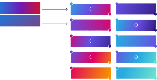
We took the existing color palette and adjusted the colors to be more complex and own-able. Through testing, we found that the use of a gradient background on our homepage performed well, so we made sure to choose colors that would create bright, crips gradients. We kept the primary dark violet color from the original palette to help keep familiarity as we moved through the transition into the new colors.
Updated Palette
Original Palette

Original Gradients
Updated Gradients
Original Icon Style
Updated Icon Style

Color Updates Guide


